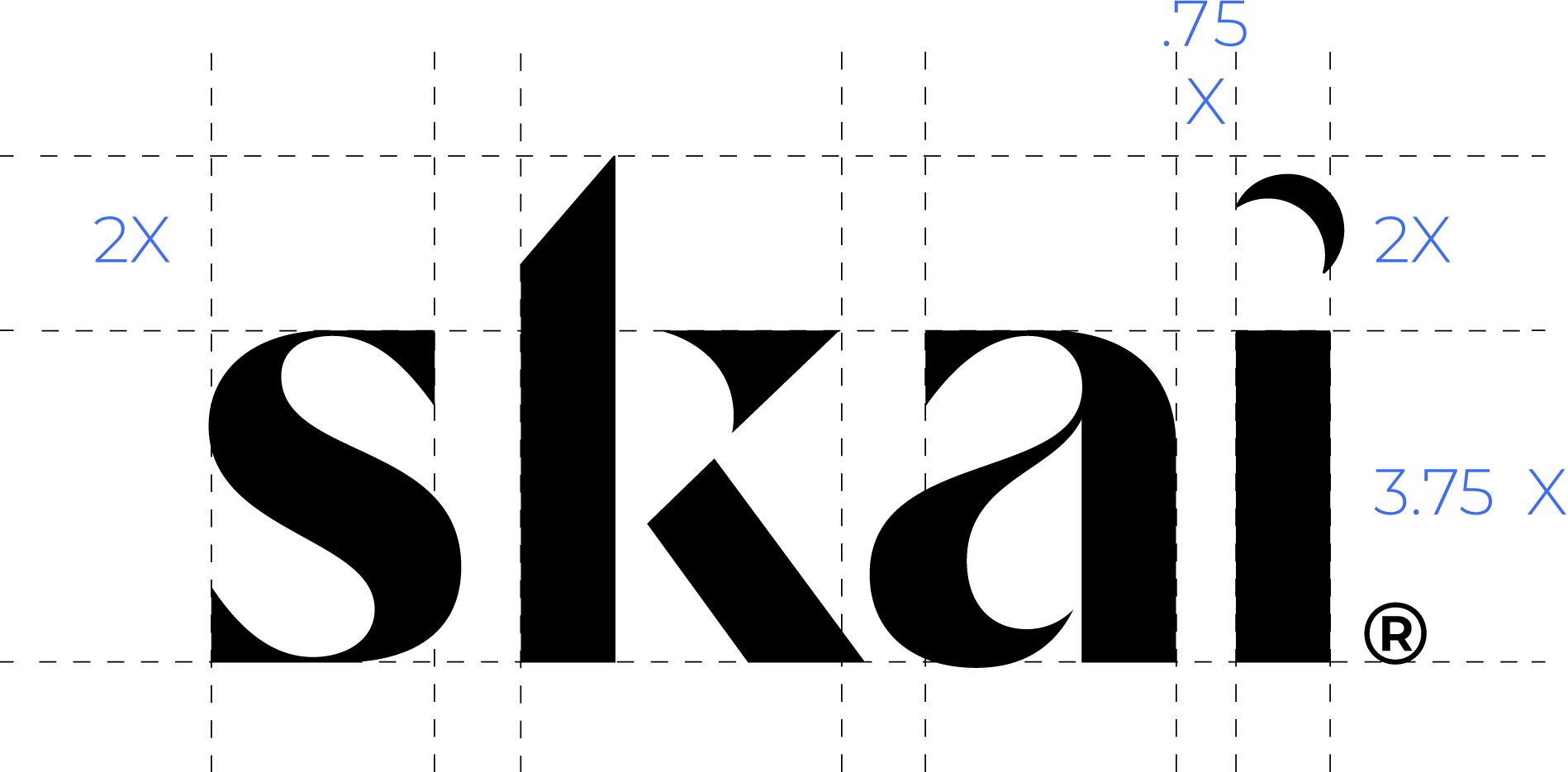
Logo structure
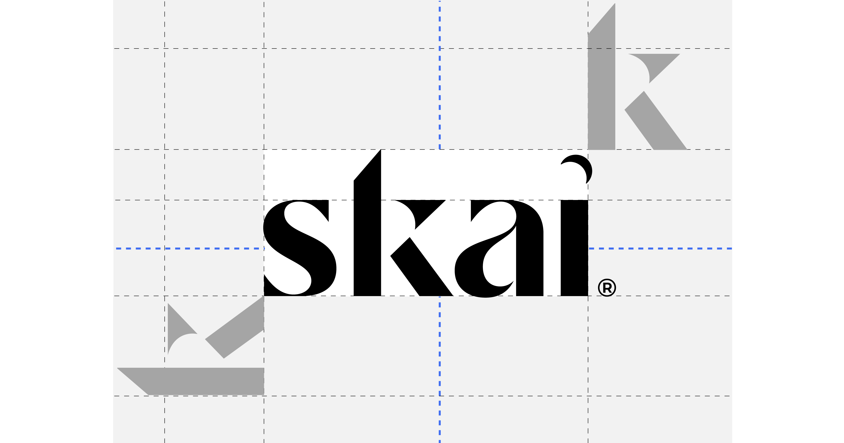
Clear space
Minimum clear space is the area around the logo and icon that must remain content-free. This “breathing space” is necessary for the logo to be legible and hold value in print and digital collateral. Logo should be left-aligned preferably with, at minimum, a “k”’s height of space surrounding it.
Minimum sizes
To maintain legibility, the logo should not go below specific sizes depending on its location. When the logo needs to be less than 54 px wide, a specific logo is required.
Logo variations
These are acceptable color uses of the logotype. The black logo on light backgrounds is to be used as the primary logotype in most cases. The legibility and color consistency of the logo should never be compromised.
Do’s
- Use the logo in the given color variations.
- Use the white logo on dark backgrounds and photography.
- Maintain the logo integrity and form when resizing the logo.
Skai vs Kenshoo Skai

Use Kenshoo Skai anytime the logo will be seen by an audience in the EMEA region, such as events.
In all other instances, use the registered version of the Skai logo.
Prohibited usage
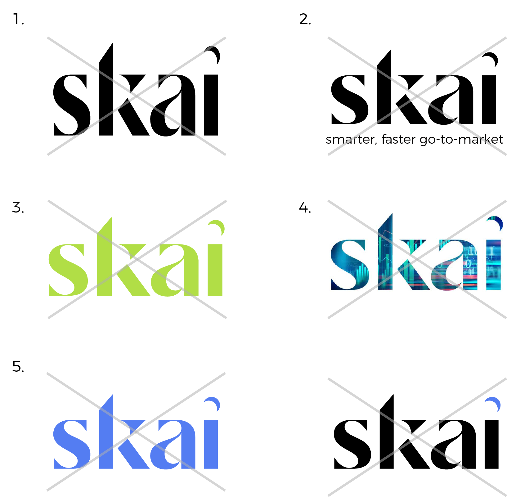
The logotype is the face of our persona and symbolic of the entire brand. It is imperative to respect the integrity of the logo and never modify it or misuse it. The following list outlines some of the prohibited uses of the logo, in order to maintain consistency and character both online and offline.
Don’ts
1) Don’t stretch or alter the proportions of the logo.
2) Don’t add a tagline with the logo.
3) Don’t recolor the logo.
4) Don’t add a pattern within the logo unless it has been created and approved by design.
5) Don’t use any color for the logo outside of black and white, even if they exist in the brand color palette.
